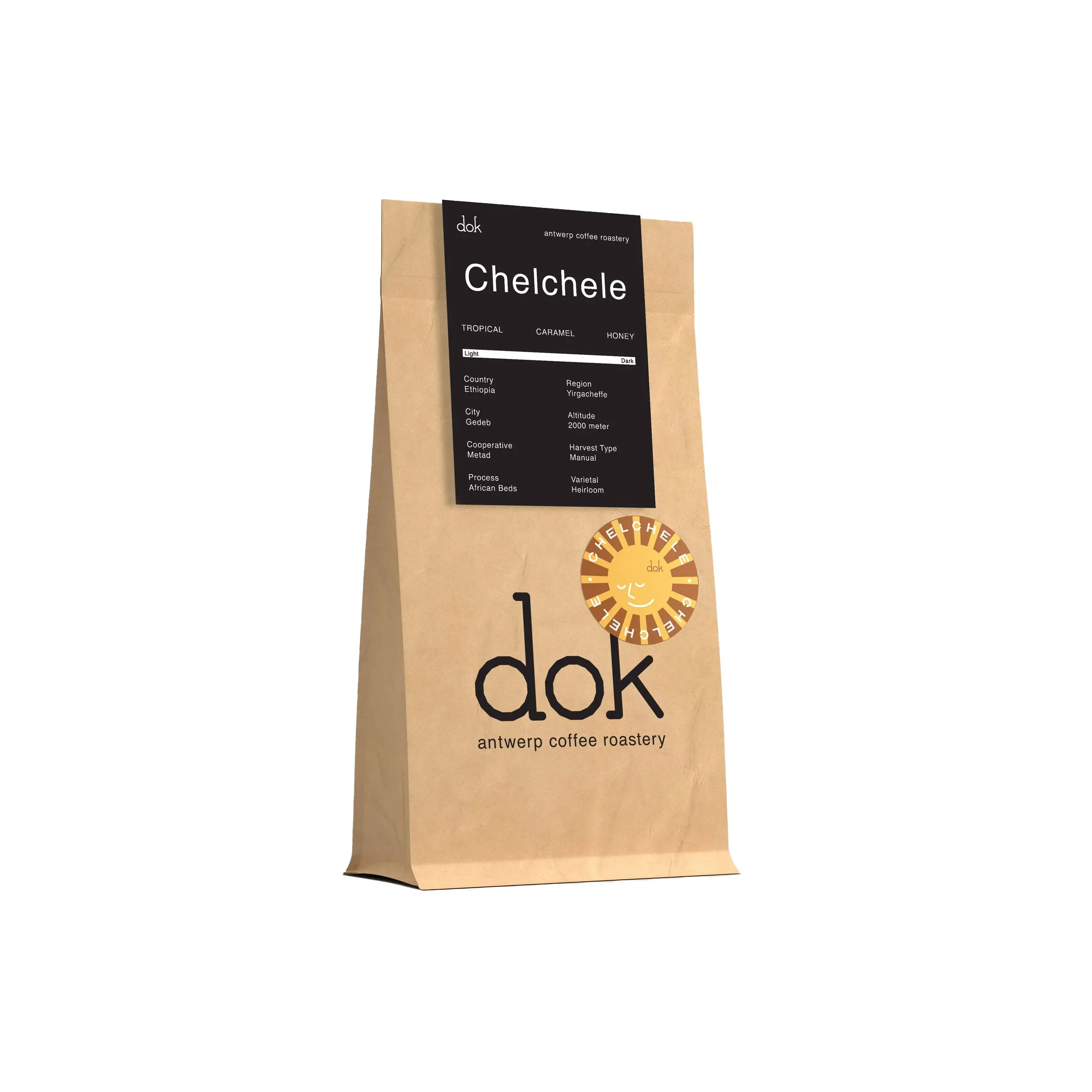
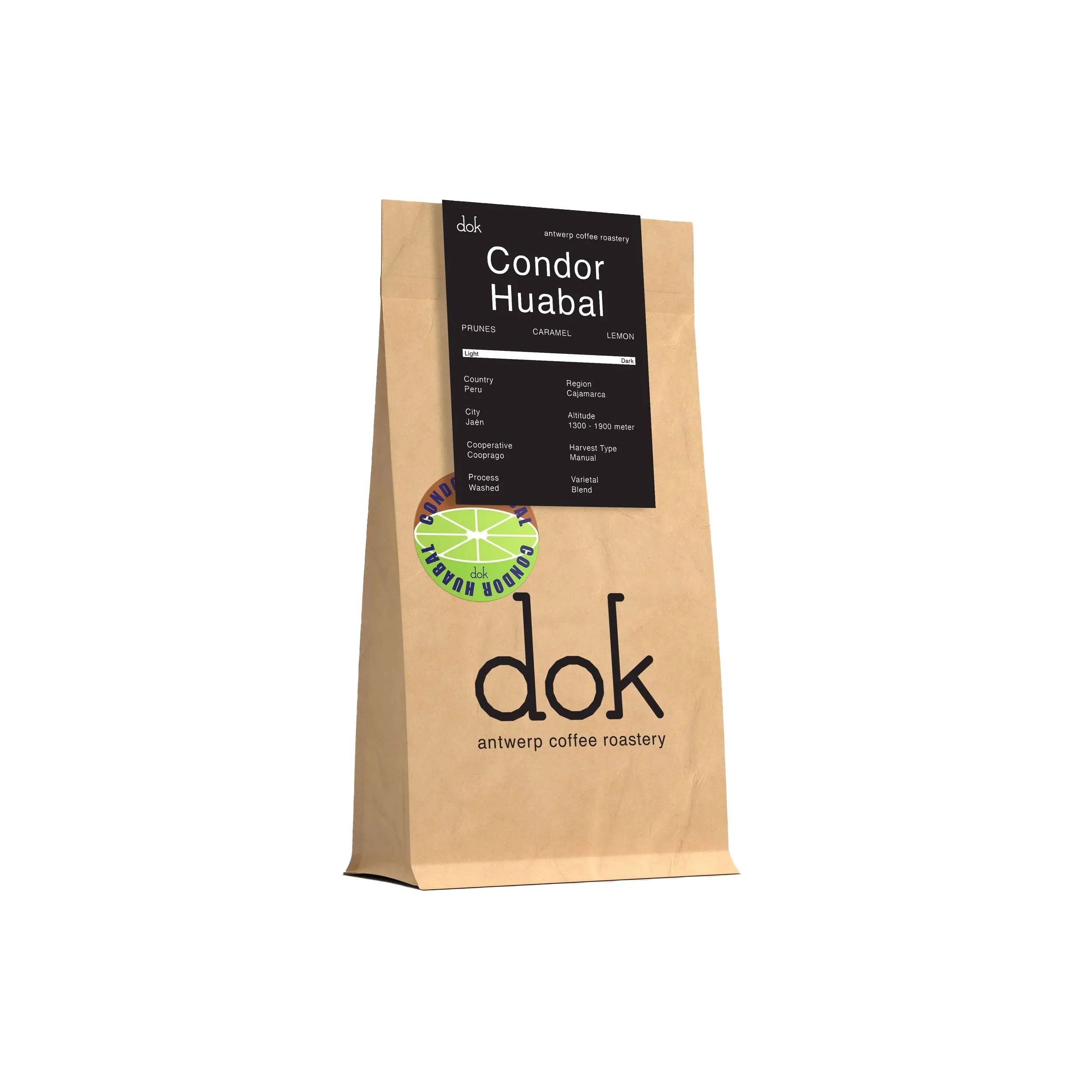
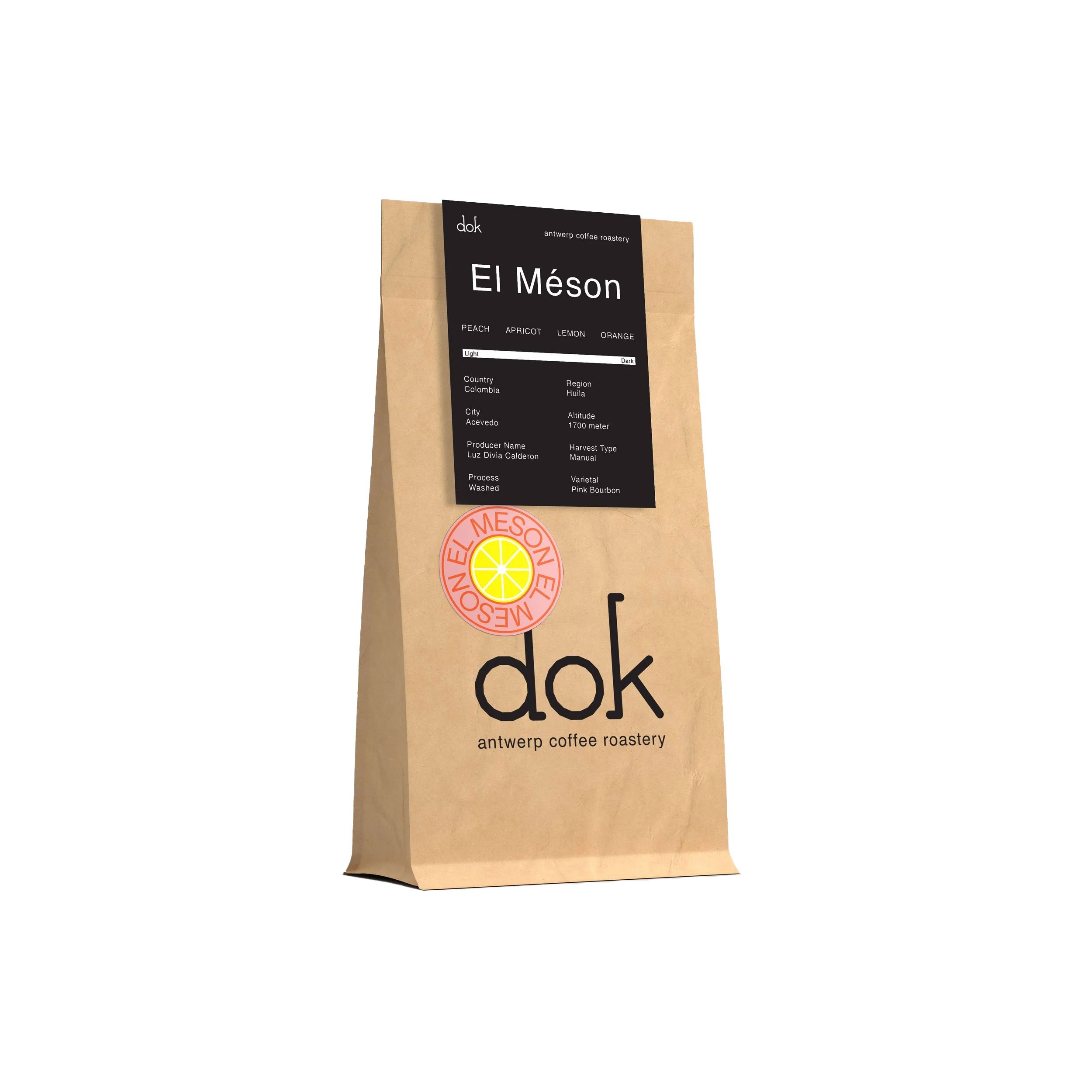
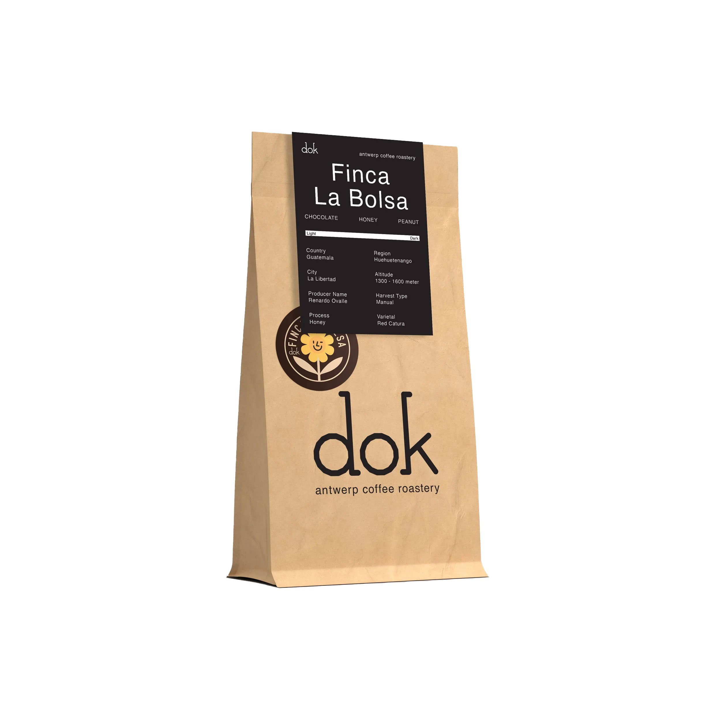
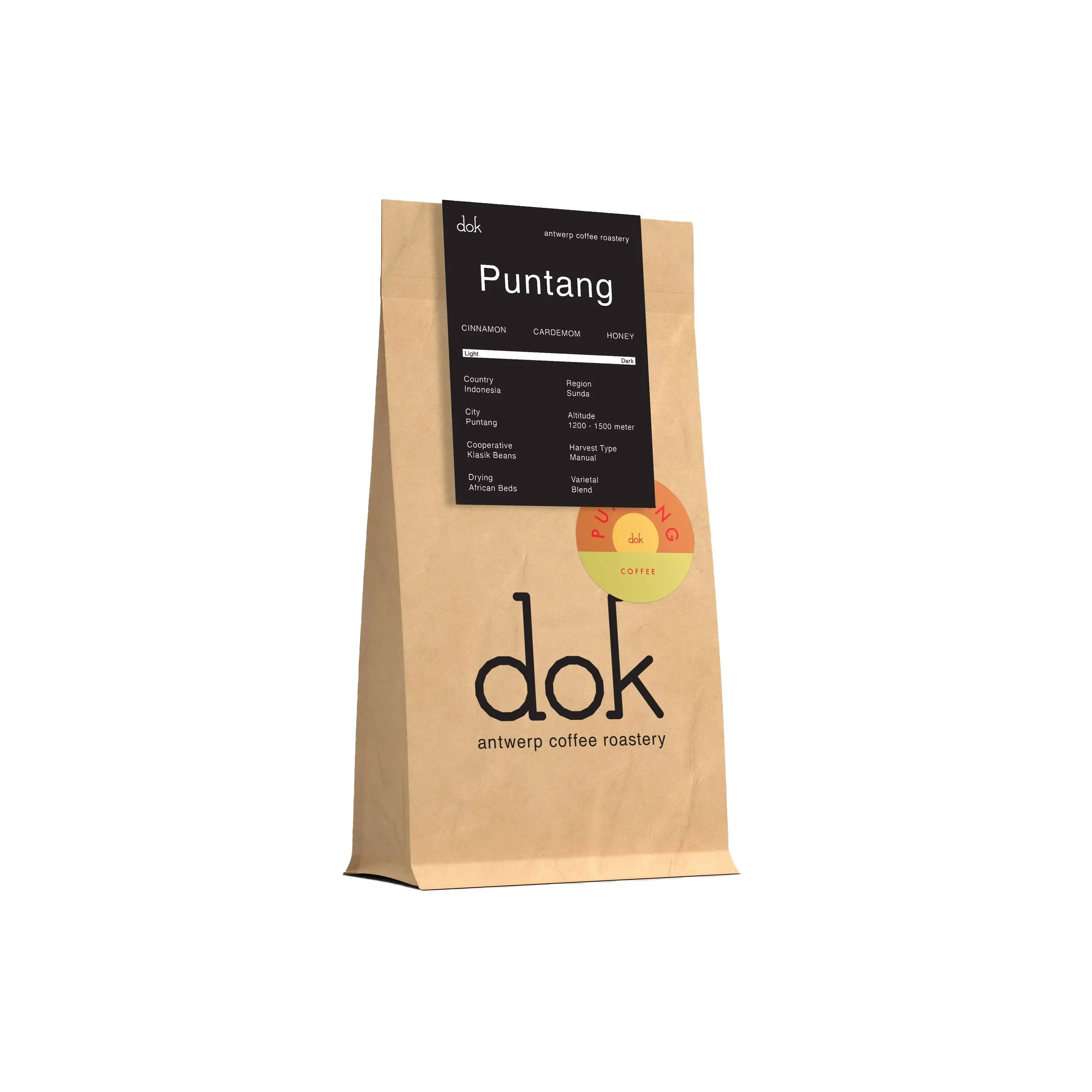
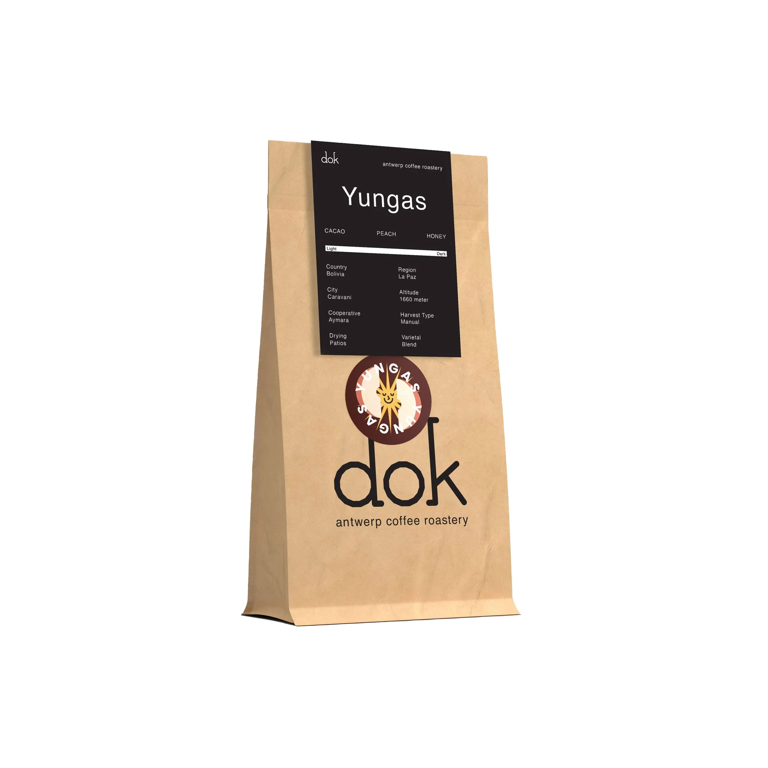
Dok is an Antwerp-based coffee roastery producing honestly sourced, hand-roasted coffee beans for small
businesses, horeca, and B2B customers. The project focused on creating a visual identity and packaging system
that reflects the craft, transparency, and hands-on nature of the roasting process.
I designed a custom logotype as the foundation of the identity. Alongside the logo, I developed a flexible
packaging concept that combines printed structure with manual elements. Each coffee is finalized with a
color-coded round sticker that displays the name of the blend and hints at its flavor profile.
The result is a simple,flexible packaging system that highlights the craft behind the product. By combining strong
design with handwritten details, the identity reinforces Dok’s focus on honesty, small-scale production, and quality.